glenn_MA_graphics

Updates and reflection on MA Graphic Design studies.

Reflective Statement

The process of managing a blog and presenting academic research here has proven challenging. Motivated to create egalitarian graphic art, conveying the character and flaws of analog media in a digital context, I chose the keyword “Humanity”, which seemed to link to both. Academic articles about a range of relevant issues – from theological morality to computer-generated emotion – have been interesting to read, and provided visual prompts, but can’t define what “Humanity” might be.

As such, I’ve struggled to reconcile this research process with the need to produce coherent creative outcomes for Practice 1, sensing something of clear value in my enquiry, but not knowing quite what. In truth, I’ve at times wished that a these theories, theses and analyses would seep into my subconscious and infuse my creative work. …But although it’s challenging to find a direct correlation between the musings of Sartre and my design skillset, I have rationalised certain Situationist concepts, including the Society of the Spectacle, relative to my Practice 1 proposals.

In terms of using this research to inform practice, it’s been valuable to learn more about graphicacy and semiotics, and I’m particularly drawn to employing pictograms in my designs, having recognised their similarity to historic representations of humanity in Paleolithic art. Indeed, the excitement of seeing such connections for the first time – between academic theories and practice, or discrete areas of creative practice – constitutes the most rewarding part of a research project such as this; thus it was revelatory to me that cave paintings might be viewed as public art, and in some respects may not be so different from modern representations of humanity in shop windows and on road signs.

Perhaps the most surprising connection I’ve found is between glitch art and analog media, their potential for interaction offering a new dynamic for attempts to bring humanity’s imperfections into the digital realm. Without taking my own embryonic findings into a tutorial discussion, I wouldn’t have thought to explore this area, and this not only underlines the value of allowing research methods to spontaneously change direction, but of the free-thinking interaction of humans: it’s as if appreciating a spark within human-to-human communication offers a key insight into humanity’s condition, which, of course, only confirms Mark Pagel’s position, as reported on this blog.

Prominent within my practice-linked research have been the triumvirate subjects of anti-consumerism, analog media and public art, each equating with aspects of “Humanity” in my mind. However, there was no strategy beyond starting with graphic artists referenced in SAT1, and, at some point, focusing on how image and typography (predominantly analog) is used by contemporary practitioners, specifically within graphic art installations and exhibitions; even then I found it enlightening to detour via the work of Sister Corita Kent.

While I didn’t plan a non-linear approach to this research, on reflection, I see that a certain unevenness often pervades my work, despite intentions to impose a structure. Sometimes this is problematic, but it can create the conditions for unexpectedly positive outcomes, and, in the context of researching a multi-faceted subject like “Humanity”, may be appropriate, even representing it to some degree: diverse, unpredictable, making significant mistakes along the way but, hopefully, having a potential for good.

Considering “wishful thinking”

glish1Mod1Fig. 1 Glenn Rickwood ‘Wishful Thinking Glish (sic) Balloon’
analog/digital graphic (2014)

While reviewing my existing FAT1 work, to see how it might be refined to meet the requirements of FAT2, I begun to brainstorm a few relevant phrases, one of which was “wishful thinking”. Having failed to find relevant results, via the UH online library, when I searched for terms like “wish” and “humanity wish” in late November, I was surprised to find that “wishful thinking” highlighted several papers that could be of interest, and inspire useful concepts…

In “Wishful Thoughts and Source Monitoring”, several experiments are conducted to ascertain whether, in hoping for a positive outcome from a situation, a person might distort memories connected with it, so that a source (often the person him/herself) predicting positives is retrospectively seen as being more reliable than one that does not. There is no clear outcome: “Wishful thinking may simply be a special case of schema or halo/devil effects and may not exert complex or global influence on memory” (Gordon et al 2005: 424). The opportunity to offer a visual response to this statement is clear.

“Non-cognitivism and Wishful Thinking” examines the effect of positivity on the philosophical position that moral judgements are either true or false and therefore must also be true or false, suggesting that “If people deserve to be interpreted in such a way that the premises of the inferences they take to be immediate and unproblematical generally imply their conclusions, then surely they also deserve to be interpreted in such a way that the acceptance of the premises of those inferences generally gives them reason to believe their conclusions” (Dorr 2002: 102). The notion that wishful thinking has a moral dimension could certainly be interpreted visually.

The aim of “Wishful Thinking and Self-deception” is to establish whether there is a distinction between the two, and the author does present a clear argument as to how and where a divide should be placed, which, again, might offer a visual lead: “The person to whom we ascribe wishful thinking does not pervert the procedures whereby we establish truth and falsehood. When evidence is brought before him that conflicts with his belief, he will, perhaps reluctantly, acknowledge it as counting against his belief” (Szabados 1973: 205).

In “Wishful Thinking About the Future: Does Desire Impact Optimism?”, the differences between wishful thinking and motivated reasoning are discussed in terms of how they might positively influence a person’s mental state. Although no clear evidence is presented – “there are many opportunities for creating more definitive and thorough understanding of the questions of whether, when and why desires bias optimism” (Krizan, Z., & Windschitl, P. D. 2009: 239) – a design motif conveying optimism may well be of interest.

Taking these observations into account, I’m experimenting with ways to extend the range of my “wishlist” and pictogram figure concepts (Fig. 1), so that they might offer public-facing anti-consumerist content in an engaging, even entertaining, way.

References

Dorr, C. (2002). ‘Non‐cognitivism and wishful thinking’, Nous, 36(1), pp.97-103. [online] Available at: https://uhvpn.herts.ac.uk/stable/,DanaInfo=www.jstor.org+3506104#page_scan_tab_contents
[Accessed 1 January 2015]

Gordon, R., Franklin, N., & Beck, J. (2005). ‘Wishful thinking and source monitoring’, Memory & Cognition, 33(3), pp.418-429. [online] Available at: https://uhvpn.herts.ac.uk/,DanaInfo=scholar.google.com+scholar?start=60&q=wishful+thinking&hl=en&as_sdt=0,5
[Accessed 1 January 2015]

Krizan, Z., & Windschitl, P. D. (2009). ‘Wishful thinking about the future: Does desire impact optimism?’, Social and Personality Psychology Compass, 3(3), pp.227-243. [online] Available at: https://uhvpn.herts.ac.uk/,DanaInfo=scholar.google.com+scholar?start=110&q=wishful+thinking&hl=en&as_sdt=0,5
[Accessed 1 January 2015]

Szabados, B. (1973). ‘Wishful thinking and self-deception’. Analysis, 33(6), pp.201-205. [online] Available at: https://uhvpn.herts.ac.uk/,DanaInfo=scholar.google.com+scholar?start=110&q=wishful+thinking&hl=en&as_sdt=0,5
[Accessed 1 January 2015]

Type, colour, pattern and form

There may be other tributaries of theory-based research I’ll want to explore as FAT2 progresses – and certainly within Practice 2 – but now I think the main flow of this content, mostly focused on interpretations of the keyword “Humanity”, is slowing so that I must take an overview of it and determine how to refine the visuals created in FAT1, which will inform my submission for FAT2. As part of this process, I want to establish a design methodology for my outcomes that draws inspiration from the work of relevant practitioners (whose work I admire) but does not mimic it, and, therefore, further consideration of such creatives is warranted…

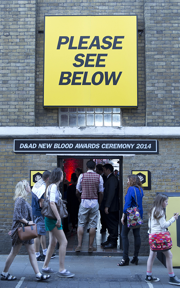
In terms of displaying visual communications on a large scale, the methods employed by Morag Myerscough merit further attention, introducing characterful type, strong colours and geometric patterns to a variety of environments: “I like interpreting spaces, really” (Walters, 2011). Over the past two decades she has endeavoured to redefine the role of a graphic designer as perceived during the 1980s, establishing associations with architectural practices so that she might transcend the limitations of traditional 2D work, but not abandon its skillset, thus applying the use of colourful banners, tear sheets, stencils and stapled captions to the walls of exhibition spaces created by architects. It is this attachment to analog design techniques, linked to her ability to adapt them in new contexts that interests me most: “Sometimes you forget you can get off your arse, pick up a pair of scissors and make something” (Walters, 2011).

To facilitate the production of her larger projects, Myerscough will work in collaboration with other members of Supergroup, an extended network of creatives from different disciplines founded in 2010, though this is complemented by her desire to make personal design objects (including a lamp fashioned from surgical tubing and high-heeled shoes affixed to dinner plates), such experimentation helping to ‘free up’ her approach to design.

Discovery-Pavilion
Fig. 1 Morag Myerscough, Discovery Pavillion, Library of Birmingham (photograph by Gareth Gardner) (2013) [image online] Available at: http://supergrouplondon.co.uk/wp-content/uploads/2010/04/Morag-Myerscough-luke-morgan-supegroup-london-discovery-Pavilion_photo-credit-Gareth-Gardner-470×574.jpg

NGNG
Fig. 2 Morag Myerscough, No Guts No Glory mural and poster (2013) [image online] Available at: http://supergrouplondon.co.uk/wp-content/uploads/2010/04/Image_NO_GUTS_NO_GLORY_MORAGMYERSCOUGH_POSTER.jpg

DeptfordTrain
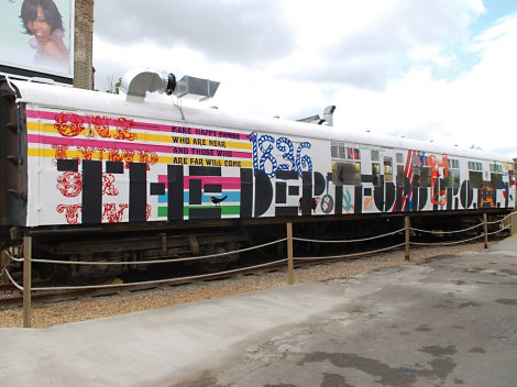
Fig. 3 Morag Myerscough, The Deptford Project Train community cafe (2011) [image online] Available at: http://supergrouplondon.co.uk/wp-content/uploads/2010/04/page_5-470×352.jpg

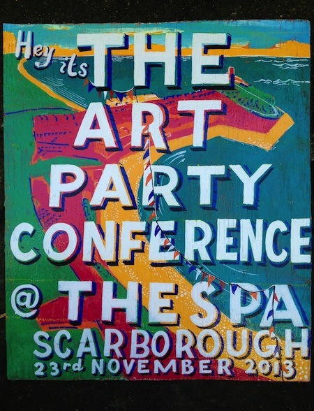
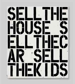
Myerscough’s use of bold, hand-rendered type is reminiscent of the work of Bob and Roberta Smith, the professional alias of artist Patrick Brill, Associate Professor at the Cass art college. Brill’s ‘slogan art’ operates in a more overtly political way, however, and he is an active advocate for art education in schools, strongly critical of Michael Gove’s policies as Education Secretary; indeed, he has just announced that he will stand against Gove in the 2015 general election. Much of his work – primarily typographic accounts of deadpan political statements – is painted onto rough wooden boards and seek to make a connection between the fine art world and the historic craft of signwriting. Notable amidst his recent projects is the founding of the Art Party, in 2013, which focuses on “creating a vibrant visual language for political thinking, bringing the artworld and the public realm into an alliance and questioning the position of artistic output in relation to public debate” (The Cass, n.d.).

Bob and Roberta Smith’s forays into three-dimensional or sculptural areas involve pieces – such as Fig. 6 and Fig, 7 – much smaller in scale than Myerscough’s but they are equally engaging, arguably more playful, and certainly more confrontational, being less concerned with a narrative connected with the space in which they are shown and using the physical elements as props with which to reinforce or dramatise Brill’s message.

ArtPartyFig. 4 Bob and Roberta Smith, Art Part Conference poster (2013) [image online] Available at: http://media.tumblr.com/d735bd6541dab6cb8945836c4ddd6962/tumblr_inline_mrmc07vB3x1qz4rgp.jpg
[Accessed 24 December 2014]

Children
Fig. 5 Bob and Roberta Smith, Art Makes Children Powerful poster (2012) [image online] Available at: http://d21l08rhwa1wjv.cloudfront.net/000/060/915/60921.jpg
[Accessed 24 December 2014]

Barack2009
Fig. 6 Bob and Roberta Smith, I Wish I Could Have Voted for Barack Obama installation (20o9) [image online] Available at: http://imageobjecttext.files.wordpress.com/2012/03/bob-and-roberta-smith-i-wish-2009.jpg?w=584
[Accessed 24 December 2009]

Soapbox
Fig. 7 Bob and Roberta Smith, Art Soapbox sculpture (2012) [image online] Available at: http://crackmagazine.net/wp-content/uploads/2013/12/Screen-Shot-2013-12-16-at-12.59.26-1024×681.png

Another fine artist employing typographical techniques is Christopher Wool, whose works often feature black, crudely stencilled, characters on a white ground, the words being split in ways that defy logic and make them harder to read, and might be said to reflect the fractured, unsettling qualities predominant in modern urban life. The phrases Wool presents are often confrontational, not least that in his 1988 piece, Apocalypse Now, which quotes a somewhat nihilistic line from the film of the same name: “its logic is as coarde as its rough grid of letters. Its tone is as suffocating as its lack of white space. Its execution is not careful and considered, but hasty” (Giampietro, 2009). (…And, of course, given that it recently sold for more than $26m at a Christie’s auction in New York, the excessive commodification of art intended to challenge consumerism might be said to only underline the futility of such gestures in the grand capitalist scheme of things.)

apocalypse_now
Fig. 8 Christopher Wool, Apocalypse Now (2012) [image online] Available at: http://www.christies.com/lotfinderimages/d57390/christopher_wool_apocalypse_now_d5739095h.jpg

While looking through some old issues of Eye Magazine, I chanced upon the work of one Sister Corita Kent, about whom I’d previously known nothing, but whose creative output is not only compelling but seems in tune with my Practice 1 aims… Born Francis Elizabeth Kent in 1918, she spent the years between 1938 and 1968 as a nun within the Immaculate Heart of Nary Religious Community, gaining an MA in Art History at its Hollywood college site in 1951. At the start of the 1950s, her practice was influenced by Abstract Expressionist painting, but, in 1954, she began to incorporate text in her screen-printed artworks until they were dominated by it, and, by 1964, she had assimilated the attitudes of Pop Art, so that her personal creative language reflected the drama of urban life and the vernacular of advertising. But imbued with a liberal Christian ethos, it was both compassionate and egalitarian, and thus distinguished her from most of her contemporaries, especially as she addressed racism, poverty and the Vietnam war: “I admire people who march. I admire people who go to jail. I don’t have the guts to do that, so I do what I can” (Ault and Beck, 2007: 50).

Visually, Kent contorts typographic elements drawn from ad slogans, signage, song lyrics, scripture and magazines, sometimes combining them with powerful appropriated photographic imagery, within vivid colour schemes that often employ complementary colours. Even more remarkable is that she experimented with ransom note-style, cut and paste graphics (Fig. 13) more than a decade before Jamie Reid brought them to prominence in his collages for the Sex Pistols.

PowerUp
Fig. 9 Sister Corita Kent, Power Up, 1965; the title comes from a petrol ad,
the handwritten text along the bottom is from an essay about hunger by
radical priest, Daniel Berrigan. Eye Magazine 9(35) Spring (2000) Croydon, Quantum Publishing, p48

Fellow
Fig. 10 Sister Corita Kent, The Cry That Will Never Be Heard, 1969. Eye Magazine 9(35) Spring (2000) Croydon, Quantum Publishing, p51

Flowers
Fig. 11 Sister Corita Kent, Manflowers, 1969. Eye Magazine 9(35) Spring (2000) Croydon, Quantum Publishing, p51

Handle
Fig. 12 Sister Corita Kent, See The Man Who Can Save You The Most, 1969; “The Man” originally referred to a Chevrolet car dealer, but was here given a Christian spin. Eye Magazine 9(35) Spring (2000) Croydon, Quantum Publishing, p54

Ransom
Fig. 13 Sister Corita Kent, exhibition poster, n.d: early 1960s. Eye Magazine 9(35) Spring (2000) Croydon, Quantum Publishing, p57

Although there may be some conflict between graphic designer-turned-illustrator James Joyce’s  brand-led and environmental work (addressing consumerism and sustainability), his busy and colourful geometric images are interesting in their use of simplified product packaging shapes so familiar that we might become oblivious to their unlikely contours: “After separating all the elements of a drawing in Illustrator (or a scan in Photoshop) he repeatedly removes elements – outlines, features – to see how far he can go before the subject is no longer recognisable” (Walters, 2009: 72). Relative to this, the use of simplified product imagery in my FAT1/FAT2 work may well be appropriate.

Chemical
Fig. 14 James Joyce, Chemical World limited edition print, 2007. Eye Magazine 18(72) Summer (2009) Croydon, Quantum Publishing, p71

Consumpt
Fig. 15 James Joyce, Consumption image for Howie’s brand catalogue, 2007. Eye Magazine 18(72) Summer (2009) Croydon, Quantum Publishing, p73

With regards to the inclusion of human pictograms within my submission, it may be helpful to note the comments of Swiss typographer Hans-Rudolf Lutz about his collection of pictorial symbols that appear on cardboard boxes, about which he published a book, Die Hieroglyphen von Heute, in 1988: “They are not the work of professional designers, but of craftsmen-designers with little training. Their images retain a high pictorial value, and they invest them with a sensory quality and consequently a high information value. These images – and this is what I find so clever about them – are incomprehensible because they are not dogmatic. They utilise the whole spectrum from realistic to abstract. Professional designers, by contrast, tend to confuse simplification with schematisation and design their pictograms to death” (Schwemer-Scheddin, 1996: pp.14-15).

PictFigures
Fig. 16 Anon, pictograms on cardboard boxes, collected by Hans-Rudolf Lutz, 1988. Eye Magazine 6(23) Winter (1996) Croydon, Quantum Publishing, p15

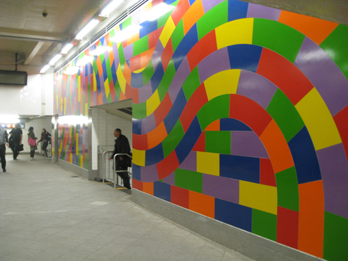
Lastly, in terms of visual inspiration, I’ll reference the wall drawings and paintings of American conceptual artist Sol LeWitt, for which he devised a complex system of shapes that, even after his death in 2007, continues to be applied to interior and external public spaces in line with his detailed instructions and diagrams (by a team of dedicated art-technicians). Despite, or, possibly, because of, their entirely decorative content – with no manner of overt statement intended – the effect of these pieces in a thoroughfare context is both effective and affecting…

SolLewittStyleFig. 17 Sol LeWitt, Wall Drawing #1152 Whirls and Twirls, MOMA, New York (2005)
[image online] Available at: http://media-cache-ec0.pinimg.com/736x/d9/10/6b/d9106bc88d8b276f4e54504251867eda.jpg
[Accessed 26 December 2014]

SolLewittSubway
Fig. 18 Sol LeWitt, Whirls and Twirls (MET), 59th Street-Columbus Circle subway station, New York (2009) [image online] Available at: http://www.artsobserver.com/wp-content/uploads/2011/09/IMG_5784.jpg
[Accessed 26 December 2014]

In the coming weeks I must resolve a number of issues within my Practice 1 project, including how  human figures/pictograms will feature in its imagery, how the typographic elements can be presented, and how this graphic art intervention might relate to other components within the nominated public space; close reference to the work, or views, of the artist/designers discussed above will be central to this.

…And to be specific about how the views [rather than the work] of creative practitioners might provide inspiration, I’ll briefly highlight Manchester-based graphic designer David Crow’s intention to present, to the public, ideas unconnected with commercial gain: “I’m trying to find out how visual artists or designers can make culture more relevant to those that consume it (Thrift, 1995: 60). …For while I don’t much care for Crow’s style on an aesthetic level, it’s noteworthy that “[he] could see a clear link between the Situationist Guy Debord’s argument that we live in a ‘society of spectacle’ and changes designers were making in the high streets of Britain, where design was enjoying a new prominence and glamour” (Poynor 2003: 159).

Moreover, his attempts, throughout the 1990s, to interact with urban public spaces (often by turning graffiti art into ‘pseudo-corporate’ logos) may be of value in defining the iteration of my Practice 1 ideas, especially the comments made about the need to let viewers interpret an artwork it in their own way, by attaching ambiguity to the concepts and imagery used: “The fact that something doesn’t communicate a precise meaning could be a strength. Sometimes you need to transfer information quickly, but sometimes there’s a leisure element, entertainment. You can stimulate people” (Thrift, 1995: 58).

CrowFig. 19 David Crow, graphics from Trouble magazine on a makeshift hoarding in Bethnal Green, London, 1991. Eye Magazine 5(19) Winter (1995) Croydon, Quantum Publishing, pp.54-55

References

Ault, L. and Beck, M. (2000) ‘All you need is love’. Eye Magazine.
9(35) Spring. pp. 48-57.

The Cass (n.d.) People: Patrick Brill (aka Bob and Roberta Smith) [online] Available at: http://www.thecass.com/people/s/bob-and-roberta-smith#Profile
[Accessed 24 December 2014]

Giampietro, R. (2009) ‘The artful charm of the public notice’. Eye Magazine. 19(73) Autumn. pp.82-83.

Poynor, R. (2003), No more rules: graphic design and postmodernism, London: Laurence King.

Schwemer-Scheddin, Y. (1996) ‘Reputations: Hans-Rudolf Lutz’. Eye Magazine.
6(23) Winter. pp.10-16.

Thrift, J. (1995) ‘Signs of trouble’. Eye Magazine. 5(19) Winter. pp.54-61.

Walters J.L. (2011) ‘In the thick of it’ Eye Magazine [online] Available at: http://www.eyemagazine.com/feature/article/in-the-thick-of-it
[Accessed 24 December 2014]

Links

http://artdaily.com/news/65427/Christie-s-New-York-to-offer-Christopher-Wool-s-Apocalypse-Now–1988#.VJr6-B_ALQ

Who are Bob and Roberta Smith?

http://www.corita.org/coritabio.html#

http://crackmagazine.net/art/bob-and-roberta-smith/

Die Hieroglyphen von heute

http://supergrouplondon.co.uk/index.php/morag/

http://www.theartstory.org/artist-lewitt-sol.htm

http://vimeo.com/44786029
[Morag Myerscough making No Guts No Glory]

Character, flaws and glitches

In connection with this enquiry into “Humanity”, I’ve previously said that some attention would be paid to “Character” and “Flaw[s]/[ed]” (certainly in my post of 28 October), and as I look to refine my FAT1 ideas within FAT2, I’m keen to assess how aspects of both might be incorporated visually into my ongoing creative work. …There’s much that’s both characterful and flawed in the artworks I’ve considered in these postings – notably that by Adbusters, Warhol, Myerscough and Menkman, as well as in the examples of cave art and ‘found’ pictograms of the human figure – while research into mankind’s relationship with animals has prompted reflection on the more primal, cruder facets of the human psyche. Now, sketching some ideas for some public art interventions, I’m still minded to update some Paleolithic imagery for the ‘edification’ of 21st century consumers, with analog mark-making techniques well to the fore, but also think that it might be interesting to counterpoint this with some manner of digital manipulation, and thus think it could be valuable to take a further look at glitch art… (…A personal link to the term “glitch” being that it was, allegedly, coined, in 1962, by astronaut John Glenn, the man after whom I’m named.)

Eelco den Heijer’s paper, Evolving Glitch Art, chronicles attempts to establish the digital equivalent of a genetic genotype that can be applied, as a glitch art process or ‘recipe’, to digital imagery so that it might be altered in a systematic and controlled manner: acknowledging that glitch art is a new and emerging form of art about which there very few scientific publications have been written, the purpose of this investigation is to ask “can we evolve aesthetically pleasing images that are different from images we know from previous evolutionary art systems?” (Heijer 2013: 110). However, in assessing whether engaging imagery is reducible to the computation of an effective formula – reviewing existing glitch art generators such as the GlitchBot programme along the way – it soon becomes apparent how easy it is for artistic content to be subsumed within a complex mathematical process. …Unless, of course, that becomes the point of the exercise and the process itself is the [art’s] message, but relative to Heijer’s agenda to create appealing images, this would not seem relevant in this case.

GlitchTechsFig. 1 Eelco den Heijer, examples of glitch art operations (2013),
‘Evolving glitch art’, Evolutionary and Biologically Inspired Music, Sound, Art and Design. [online], p114

As I’d presumed in my post of 28 November – following my own blundering experiments with glitch generation – it is entirely possible for those with sufficient technical acumen to rationalise and categorise a wide range of effects resulting from targeted disruptions of image-code, a full account of her team’s visual probings being presented by Heijer (Fig. 1), almost all of which manage to avoid the destruction of the image through ‘over-recoding’. …But, again, such forensic dismantling of the glitch art process may be seen to devalue it and, definitely, diminish any mystery that might be inherent within this young artform: it is as if by scientifically analysing the composition and production of Picasso’s Guernica, one had removed all reference, and emotional response, to the subject matter (…for I’d contend that the ongoing value of this kind of digital art will be in [artists] responding emotionally to the sociopolitical conditions that have given rise to such media opportunities.)

The lack of substantive academic research on glitch art makes it difficult to gain a balanced view of the form’s substance or clearly identify its key practitioners – little biographical detail being available through recognised media channels – but here are a few of the more interesting examples I’ve chanced upon…

(Mathieu St. Pierre is an experimental artist from Canada, who has applied his experience of working with video and photography to the area of digital generative art, disrupting the data held within individual video frames…)

IceCream
Fig. 2 Mathieu St. Pierre, untitled image from Melting Ice Cream series (2012) [image online] Available at: https://matstpierre.files.wordpress.com/2012/09/image106.png
[Accessed 22 December 2014]

(Sabato Visconti is a Brazillian photographer/illustrator who has experimented with glitch imagery in recent years, looking to recreate certain of the distortions he saw as a child on analog TV…)

Sabo
Fig. 2 Sabato Visconti, untitled image (2014) [image online] Available at: http://media.boingboing.net/wp-content/uploads/2014/08/untitled14.jpg
[Accessed 22 December 2014]

(Canadian illustrator and musician Stephen Lofstrom has applied glitch art techniques to a variety of digital outcomes and physical merchandise…)

StephenLofstrom
Fig. 3 Stephen Lofstrom, untitled image (2014) [image online] Available at: http: http://www.redefinemag.com/wp-content/uploads/2014/01/tumblr_mticoq91A51roo3oco1_r1_1280-e1390972312199.jpg
[Accessed 22 December 2014]

(Mischa Henner, Manchester-based photographer/artist has taken aerial photographs of landscapes that include secret military installations, pixelating the politically sensitive areas…)

Henner
Fig. 4 Mischa Henner, untitled image from Dutch Landscapes (2011) series [image online] Available at: http://i.guim.co.uk/static/w-620/h–/q-95/sys-images/Guardian/Pix/pictures/2013/10/24/1382604926322/Art-work-by-Mishka-Henner-001.jpg
[Accessed 22 December 2014]

The final point to mention here, is that, as a result of guidance in a late-November tutorial, I’ve become aware of the potential for glitch techniques to be applied to the creation of three-dimensional artworks, the extraordinary manifestation of this being a wooden cabinet hand-carved by Ferruccio Lavani that appears as depicted in a distorted digital photograph…

Cupboard
Fig. 5 Ferruccio Lavani, Good Vibrations cabinet (2013) [image online] Available at: http://www.thisiscolossal.com/wp-content/uploads/2013/03/vibrations-1.jpg
[Accessed 22 December 2014]

…Perhaps this intriguing approach to linking the discrete character and flaws of digital and analog media could be utilised by disrupting the frame of a hoarding displaying an image relevant to my proposed art interventions.

References

den Heijer, E. (2013). ‘Evolving glitch art’, Evolutionary and Biologically Inspired Music, Sound, Art and Design. [online] pp.109-120. Berlin: Springer. Available at: https://uhvpn.herts.ac.uk/,DanaInfo=scholar.google.com+scholar?q=evolving+glitch&btnG=&hl=en&as_sdt=0%2C5
[Accessed 24 November 2014]

Links

http://www.digitalartsonline.co.uk/news/photography/glitch-inside-one-of-this-years-key-photography-trends/

http://www.eyemagazine.com/review/article/famous-for-fifteen-megabytes

http://www.theguardian.com/artanddesign/2013/oct/25/rise-of-glitch-art

View at Medium.com

http://www.redefinemag.com/2014/glitch-art-expression-through-an-aesthetic-rooted-in-error/

Good Vibrations: An Intricately Carved Cabinet Looks Like a Digital Glitch [Updated: It’s a 3D Rendering of an Upcoming Piece]

The future of humanity

A subject like “Humanity” is immense in terms of the material that might be referenced in an extended consideration of it, while, given our self-obsession as a race (which would seem to have reached a new high/low with the arrival of the ‘selfie stick’), it a can also seem all-encompassing, so that we are all that seems to matter within creation, and that all other species and our environment only have meaning relative to us, as resources.

Researching Humanity in recent months, I’ve tried to look at a range of aspects that might help to define it, including our genetic make-up, theological and philosophical interpretations of our condition, as well as historical, cultural and egalitarian definitions, and theories proposing the importance of language and status. However, the one area of my research I’ve not yet written  up is that envisaging the future of humanity, with particular regards to augmented reality, artificial intelligence and even what is called posthuman or transhuman augmentation (essentially, the possibility of genetically or mechanically modifying the human frame with physical or sensory capabilities that might colloquially be described as ‘superpowers’). But although I’m aware of the enquiries in this field being carried out by philosopher/scientists such as Nick Bostrom and the staff of the Oxford Martin [research] Project, having reached some understanding of how research material might need to be managed across the full span of this course, I’ll hold back from considering these issues in detail until the commencement of Year 2.

Tears_In_RainFig. 1 Ridley Scott [Director], Blade Runner (1982), Roy Batty – the replicant android played by Rutger Hauer – ‘dies’ [online] Available at: http://en.wikipedia.org/wiki/Tears_in_rain_monologue#mediaviewer/File:Tears_In_Rain.png
[Accessed 21 December 2014]

…As such, to give but a flavour of their remit, I’ll briefly refer to a popular portrayal of them as dissected by Judith Barad in her essay, Blade Runner and Sartre – The Boundaries of Humanity. Ridley Scott’s film of Philip K Dick’s short story, Do Androids Dream of Electric Sheep?, was perceived as groundbreaking within mainstream culture for its depiction of an austere, dysfunctional future in which the interaction of humans and mechanical humanoids is an increasingly fraught affair. Barad perceives existential angst within the androids’ attempts to elude termination by the Blade Runner special police, and sees the following questions being raised: “If artificial intelligence were placed in a body that looked and acted human, would such a machine be a human? Would a human, in turn, be nothing more than a machine? In fact, would androids differ in any important way from the humans who created them?” (Barad 2009: 21). Developing her critique, she contrasts Alan Turing’s assertion that there would be no important difference between the two with Jean-Paul Sartre’s belief that human essence must be willed into existence by a human individual and cannot be manufactured or programmed, this being consolidated by his confirmed aetheism: “Human nature can’t be determined in advance because there’s no one who know what each human will become in advance” (Barad 2009: 22).

One of the most telling factors Barad identifies within the narrative construct of Blade Runner is that the only way to differentiate between the most advanced androids and humans is a specific test that measures subtle physical and emotional responses to hypothetical questions about human or animal suffering, recognising “the emotion of empathy, the power to place oneself in the position of someone else and vividly feel the emotions of that other individual” (Barad 2009: 24).

Embedded within the plot twists are various other testings of human primacy and uniqueness and Barad concludes by noting that in terms of humans abusing or subjugating other humans, animals or androids, “only a lack of empathy could, of emotional maturity, could permit this kind of hierachical thinking” (Barad 2009: 33). …And I am inclined to agree that empathy is a fundamental attribute of what we call, or imagine to be, [our] Humanity.

References

Barad, J. (2009) ‘Blade Runner and Sartre: the boundaries of humanity’,
The Philosophy of Neo-Noir. [online] 21. pp21-34. https://www.google.co.uk/?gfe_rd=cr&ei=ytyWVOXNItPH8gfu44CQAg#q=blade+runner+boundaries+of+humanity+pdf
[Accessed 27 October 2014]

Thrashing around

Following a positive tutorial on Thursday, I’ve got a clearer view of what I now need to do to finalise the creative explorations made in connection with FAT1, and how these might link to the requirements of FAT2, particularly in terms of focusing on a target audience. …I’ve even got some appreciation of what Practice 2 entails, so that I’ve rethought my plans for FAT2, deferring the development of certain ideas to concentrate on others.

Throughout the creative/research process undertaken since the start of this course, I feel as though I’ve struggled to understand what is required within each assignment and, with regards to the creative aspect, quite how I should express my ideas, and in what style. In respect of comprehending the assignments, determining how to consolidate clear links between theory and practice at Master’s level has proved to be a major challenge, although via the UH online library I’ve been able to access a range of texts that consider “Humanity” in various ways; certainly my previous experience of of studying at Level 7 had not prepared me for this  (confirming to me the ‘peculiarities’ of that situation). The ongoing challenge of the creative output is to develop a personal style that skips the shackles of the commercial design world, which have often constrained me over the years, and is appropriate to the issues I’d like to address.

Key to this will be the refinement of an approach to critical thinking and conceptualisation that’s both idiosyncratic and selective re the choice of media employed, though, as stated in my post of 12 October, it remains my intention to incorporate as much characterful and flawed analog content in my work as possible, while the quest for ideas that are fresh and have currency is the prime objective. Thus, I imagine most of my efforts should go into ideas generation, hopefully, eliminating the obvious, overused and hackneyed, to find the odd one that, when manipulated, and its outer layers pared, reveals an essence central to the subject in hand.

TheNextDayFig. 1 Jonathan Barnbrook, The Next Day, David Bowie [image online] Available at: http://www.davidbowie.com/sites/g/files/g2000002506/f/styles/large/public/201302/2013_tnd_cvr_fix_800sq.jpg?itok=3Uzy2AgI
[Accessed 20 December 2014]

…One fairly recent example of such an idea is Jonathan Barnbrook’s cover artwork for David Bowie’s 2013 ‘comeback’ album, The Next Day (Fig. 1), which, to the best of my knowledge, is the first to appropriate, and apply methods of detournément to, imagery featured on an earlier sleeve by the same artist. By almost obscuring the iconic monochrome photograph of Bowie from the Heroes album with a white square, and redacting the original “Heroes” title while utilising the original “David Bowie” type, a number of questions are raised concerning identity, legacy and the cultural or personal value we attach to artefacts; although Barnbrook dislikes the term – “I hate being called a postmodernist (Poynor 2003: 165) – this may be one of the most potent postmodernist gestures in recent years… And having attended a lecture given by Barnbrook at Central Saint Martins shortly after The Next Day’s release, I recognise that the sourcing of retrospective imagery was initiated by Bowie, an exchange of iterative ideas continuing until the concept – to reference yet obliterate Bowie’s past – was distilled to its essence. …The one criticism I’d make of of the final outcome, but a significant one, I’d contend, is that the delivery of this seemingly throwaway radical idea was weakened by Barnbrook’s decision to display the album title in a specially designed font, perfectly kerned, when a ubiquitous ‘everyday’ typeface (Helvetica/Arial/Verdana, perhaps), or Bowie’s own scrawl, would have served the ‘non-design’ much more effectively.

Relative to this appetite for idea over technique, I do feel somewhat naive when I view the online pin boards for this MA cohort and see many instances of technically accomplished work by my peers, who seem to have a much sharper vision of their skillset and direction of travel than myself. However, I firmly believe that this sense of ‘thrashing around’ is an integral part of personal growth on this course, and, [again] hopefully, out of the turmoil something meaningful will emerge: immediately, this necessitates refining my FAT1 ideas, harnessing them to FAT2’s demands and conveying all of this in the remaining entries of this blog, which must be properly referenced according to the multiple nuances of the Harvard regime.

References

Poynor, R. (2003), No more rules: graphic design and postmodernism, London: Laurence King.

Links

http://www.davidbowie.com/album/next-day

http://www.theguardian.com/music/musicblog/2013/jan/09/david-bowie-new-album-cover

http://virusfonts.com/news/2013/01/david-bowie-the-next-day-that-album-cover-design/

Installations and exhibitions

In considering how best to site graphic art interventions in a public space, I need to look at how contemporary practitioners are working in this area, creating installations or exhibition content…

Sagmeister and Walsh’s  The Happy Show filled the second floor galleries of the Philadelphia Institute of Contemporary arts between April and August in 2012. While substance of Stefan Sagmeister’s intent to make the world a happier place might be in doubt, the boldness and inventiveness of the exhibits, many of which are interactive, maintain his hard-won reputation for playful provocation. The use of site-specific features in the gallery, particularly the priapic adornment of elevator doors (Fig. 4), is also of interest and illustrates how knowledge of, and regard for, the location in which an artwork is placed can enhance the outcome…

HappyShow2
Fig. 1 Sagmeister and Walsh. (2012)  Exhibit rating happiness at The Happy Show. [image online] Available at: http://www.sagmeisterwalsh.com/work/project/the-happy-show/
[Accessed 17 December 2014]

HappyStairsFig. 2 Sagmeister and Walsh. (2012) Rampways at The Happy Show. [image online] Available at: http://www.sagmeisterwalsh.com/work/project/the-happy-show/
[Accessed 17 December 2014]

HappyCard
Fig. 3 Sagmeister and Walsh. (2012) Public consultation card at The Happy Show. [image online] Available at: http://www.sagmeisterwalsh.com/work/project/the-happy-show/
[Accessed 17 December 2014]

Elevator7
Fig. 4 Sagmeister and Walsh. (2012) Moving elevator graphic at The Happy Show. [image online] Available at: http://www.sagmeisterwalsh.com/work/project/the-happy-show/
[Accessed 17 December 2014]

HappyEscalator
Fig. 5 Sagmeister and Walsh. (2012) Escalator graphic at The Happy Show. [image online] Available at: http://www.sagmeisterwalsh.com/work/project/the-happy-show/
[Accessed 17 December 2014]

London consultancy Cartlidge Levene has produced wayfinding and signage systems for institutions such as the Barbican, Selfridges, the V&A and the Royal College of Art, but its work for Tate Modern, promoting an exhibition of Mattisse’s paper cut-outs, was what caught my attention earlier this year, when huge vinyl shapes were applied to the building’s exterior…

Fig. 6 Cartlidge Levene. (2012) Matisse Cut-Outs exhibition graphics, Tate Modern Available at: http://vimeo.com/92608514
[Accessed 19 December 2014]

Tate
Fig. 6 Cartlidge Levene. (2012) Entrance to Tate Modern Matisse Cut-Outs exhibition. [image online] Available at: http://www.creativereview.co.uk/images/uploads/2014/04/img_5705569_0.jpg
[Accessed 19 December 2014]

The graphics at this year’s D&AD New Blood exhibition were conceived by start-up studio, The Office of Craig Oldham, Oldham having risen to some prominence as a designer with Manchester’s The Chase consultancy. Although somewhat reminiscent of Sagmeister and Walsh’s The Happy Show, Oldham’s raffish northern English wit evidently kept visitors entertained while undercutting the preciousness that sometimes overshadows the creativity on show at D&AD functions. (…But it could be argued that, given the historical importance of the yellow pencil award within the D&AD organisation, any similarity between this colour-scheme and that used at S&W’s Philadephia event, is entirely coincidental.)…

NewBlood1Fig. 7 The Office of Craig Oldham. (2014) Ideas wheel at the D&AD New Blood exhibition. [image online] Available at: http://www.creativereview.co.uk/images/uploads/2014/07/dandad_nb_2014_wheel_of_muses_0.jpg
[Accessed 19 December 2014]

NewBlood2
Fig. 8 The Office of Craig Oldham. (2014) Ideas wheel at the D&AD New Blood exhibition. [image online] Available at: http://www.creativereview.co.uk/images/uploads/2014/07/dandad_nb_2014_over_03_2.jpg
[Accessed 19 December 2014]

NewBlood3
Fig. 9 The Office of Craig Oldham. (2014) Life choices board at the D&AD New Blood exhibition. [image online] Available at: http://www.creativereview.co.uk/images/uploads/2014/07/dandad_nb_2014_wall_02_1.jpg
[Accessed 19 December 2014]

NewBlood4
Fig. 10 The Office of Craig Oldham. (2014) Entrance to the D&AD New Blood exhibition. [image online] Available at: http://www.creativereview.co.uk/images/uploads/2014/07/dandad_nb_2014_ceremony_01_1.jpg
[Accessed 19 December 2014]

Having become somewhat bored with 2D design outcomes by the end of the 20th century, Morag Myerscough’s practice now explores the application of graphic art techniques to a range of installations and environments, frequently transcending the limitations of lo-tech materials – such as hand-painted wooden boards lashed together within a scaffold-structure – to create striking and often joyful pieces that have a characterful physical presence…

Agape1
Fig. 11 Morag Myerscough and Luke Morgan (Photograph by Belinda Lawley). (2014) Temple of Agape installation, South Bank, London. [image online] Available at: http://www.designweek.co.uk/pictures/482xAny/P/web/h/h/k/_660.jpg
[Accessed 19 December 2014]

Agape2
Fig. 11 Morag Myerscough and Luke Morgan (Photograph by Belinda Lawley). (2014) Temple of Agape detail, South Bank, London. [image online] Available at: http://www.designweek.co.uk/pictures/482xAny/P/web/z/e/l/_660.jpg
[Accessed 19 December 2014]

Movement_Cafe
Fig. 12 Morag Myerscough (Photograph by Gareth Gardner). (2014) Movement Cafe, Greenwich, London [image online] Available at: http://studiomyerscough.com/wp-content/uploads/2010/07/Movement_Cafe_Morag-Myerscough.jpg
[Accessed 19 December 2014]

future_vintage
Fig. 13 Morag Myerscough. (2014) Future vintage exhibition, Goodwood [image online] Available at: http://studiomyerscough.com/wp-content/uploads/2012/03/future_vintage-goodwood-morag-myerscough.jpg
[Accessed 19 December 2014]

Also utilising London’s South Bank were Pentagram partners Daniel Weil and Naresh Ramchandani, who, in 2013, constructed a series of graphics-adorned cubes on its Thameside promenade, the exterior of which displayed portraits of young people with HIV, taken by photographer Rankin, their accounts of living with the condition visible inside through strategically placed peep-holes. The Life in My Shoes project was carried out, pro bono, for the  HIV charity, Body and Soul…

Cubes1Fig. 14 Daniel Weil and Naresh Ramchandani. (2014) Life in My Shoes, South Bank, London [image online] Available at: http://www.designweek.co.uk/pictures/482xAny/P/web/z/e/u/the-cubes-along-the-southban_482.jpg

Cubes2
Fig. 15 Daniel Weil and Naresh Ramchandani. (2014) Viewing the Life in My Shoes cubes, South Bank, London [image online] Available at: http://www.designweek.co.uk/pictures/482xAny/P/web/y/b/f/a-lady-in-red-peers-through-the-peephol_482.jpg

Each of the examples above is distinguished by either making good use of the physical attributes – including anticipated footfall –  of the site in which it is placed or by using wit and/or ingenuity to much a serious message more palatable to the public, sometimes both. I shall now give due thought to how (and if) I might incorporate three-dimensional elements within my proposals for a public art intervention, and whether it would be best sited at street-level or placed on walls or hoardings, or even, as in Fig. 13, suspended above a public space (or, maybe, exploring all of these options)…

Links

http://www.aiga.org/medalist-stefan-sagmeister/

http://cartlidgelevene.co.uk/category/work/wayfinding-and-signage

http://www.creativereview.co.uk/cr-blog/2014/april/matisse-cutouts-supergraphics-cartlidge-levene

http://www.creativereview.co.uk/cr-blog/2014/july/new-blood-craig-oldham

http://www.craigoldham.co.uk/

http://www.designweek.co.uk/whats-on/festival-of-love-at-the-southbank-centre/3038643.article

http://www.designweek.co.uk/whats-on/pentagram-puts-londoners-in-the-shoes-of-people-with-hiv/3036763.article

http://www.sagmeisterwalsh.com/work/project/the-happy-show/

http://studiomyerscough.com/

Humanity through the ages

PalHunting
Fig. 1 Anon, Paleolithic cave painting (n.d.) [image online] Available at: http://www.venamicasa.com/wp-content/gallery/la-valltorta-gassulla/hunting.jpg
[Accessed 17 December 2014]

One of the key issues I want to determine within my Practice 1 work, as FAT1 transitions into FAT2, is how far I might want to consolidate the visual links I’ve identified between the pictogram figures used on signage systems in our public spaces and those appearing in prehistoric cave paintings. As such, I thought it useful to increase my understanding of the latter, in terms of its purpose and what is being signified. Margaret W, Conkey’s article, ‘New Approaches in the Search for Meaning? A Review of Research in “Paleolithic Art”‘, considers how our appreciation of the imagery produced in this period continued to evolve. It was during the Paleolithic era – roughly between 2.5 million years ago and 10,000 B.C. – that some 95% of prehistoric technological developments were made, including the first tools, constructed from stone. Conkey states how scientific perceptions of this period altered significantly during the 20th century, so that, by the 1960s, the view that its “imagery was explained in terms of sympathetic hunting magic and associated rituals and paraphernalia was replaced by a structuralist ‘reading’ of cave art, which showed that the mages were not randomly placed on the walls in order to insure [sic] success in the hunt” (Conkey 1987: 413). Instead, Conkey notes, it was reckoned that images of particular animals were deliberately placed on certain walls within a cave network: “The cultural source first proposed for such a symbolic mapping – or mythogram – was a cosmological schema that distinguished between male and female domains” (Conkey 1987: 414). Furthermore, she pronounces that “it is clear that there can no longer be a single ‘meaning’ to account for the thousands of images, media contexts, and uses of what we lump under the sum of ‘paleolithic art'” (Conkey 1987: 414).

However, having compared a range of relevant theories, and assessing production techniques, including pigment-processing, Conkey concludes that, while no single meaning can be ascribed to Paleolithic imagery, one to interconnect a multiplicity of meanings is not yet evident. She does, though point to evidence confirming that “humans are simultaneously materialists and symbolists” (Conkey 1987: 419), and this could be of great value in helping me to create an image-scheme that might prompt members of the public to consider the effects of consumerism and their involvement with it; for while I note Conkey’s points about cave art not having magical connotations linked to hunting, not only is this unproven, but it would still resonate within a concept seeking to link the prehistoric hunt with a 21st century shopping trip, and it is more important for graphic art to present engaging examples of visual communication, I feel, than the most accurate perspective on prehistory; it still interests me to a modern equivalent of cave art that shows where good consumer hunting might take place…

In seeking other representations of humanity that might help to express the aggressive competition underpinning consumerism – glaringly evident in the recent ‘Black Friday riots’ – I’ve also considered the Bayeux Tapestry’s iconic depiction of the Battle of Hastings. But in her book, The Rhetoric of Powe in the Bayeaux Tapestry, Suzanne Lewis argues that the work is misunderstood when solely perceived as a visual communication and that the many Latin inscriptions featured within it, identifying both persons and places, strongly indicate that its designer intended it to be viewed foremost as an authoritative text: “As the Norman conquest inaugurated a new era of written documents in England, the Bayeux tapestry stands at the beginning of a gradual new confidence in the written record (Lewis 1999: 10). Moreover, its content was purposefully constructed to challenge, but entertain, its late-11th century, literate or semi-literate, court [target] audience. (…As such, any ‘commemoration’ I might make of the Black Friday riots should look to update this approach.). Furthermore, Lewis maintains that it would have been common for a narrator to have voiced the flow of its cinematic narrative at public performances; thus, an elementary multimedia experience would have been set before the audience (for which there could certainly be a 21st century equivalent…).

It is also worth noting  Lewis’ claim that “although modern scholarship on the Bayeux Tapestry has focused much of its energy on determining the degree of ‘truth’ or facticity that can be claimed for its striking account of the Norman Conquest of 1066, the question probably would have been a matter of indifference to medieval viewers [as] ‘truth’ about the past had a very different resonance and valence in the medieval experience” (Lewis 1999: 14).

bayeux-tapestry-harold-1
Fig. 2 Anon, Bayeaux Tapestry (1066) [image online] Available at: http://mirax.files.wordpress.com/2009/03/bayeux-tapestry-harold-1.jpg
[Accessed 17 December 2014]

Grayson Perry’s latest tapestry is something of a contrast to the Bayeaux tapestry in both narrative tone and ambition, but its attempt to encapsulate ‘British values’ in a single image is witty and vital, and “like a lot of Perry’s work, teeters at the junction between earnestness and satire” (Higgins 2014). But although I admire Perry’s stance and the intelligence of his work, it does make manifest the need to judge the tone of such social commentary very carefully…

Grayson Perry tapestry
Fig. 3 Grayson Perry, Comfort Blanket, (2014) [image online] Available at: http://static.guim.co.uk/sys-images/Guardian/Pix/pictures/2014/10/21/1413913506230/Grayson-Perry-tapestry-017.jpg
[Accessed 17 December 2014]

…Finally (for this post), inspecting the Bayeux Tapestry’s visual narrative, made me think of one of my favourite paintings, Paul Gauguin’s Where Do We Come From? What Are We? Where Are We Going?, which ponders the human condition, presenting each stage of our journey from birth to death (and, perhaps, beyond…) within a complex composition that’s as rich symbolically as it is in colour. Subsequently researching Gauguin’s mission to seek out a simpler lifestyle in Tahiti, in 1891, it was interesting to read Sandra L. Bertman’s analysis of the painting, which clearly accords with Lewis’ consideration of the iconic tapestry: “The piece should be viewed as a text from right to left – a suggestion imparted by the artist’s own letters – with the various figures representative of questions relating to human existence” (Bertman 2006).

The creation of a simpflied graphic for a tableau image of this kind would be a challenge, but an engaging one, perhaps, as the explorations of FAT1 are, incrementally, brought in line with the client-led requirements of FAT2.

WhereDoWeFig 4. Paul Gauguin, Where Do We Come From? What Are We? Where Are We Going?, (1897) [image online] Available at: http://www.gauguin.org/images/paintings/where-do-we-come-from-what-are-we.jpg
[Accessed 14 December 2014]

References

Bertman, S.L. (2006) ‘Where do we come from? What are we? Where are we going?’ NYU School of Medicine, Literature, Arts and Medicine Database [online] Available at:  https://uhvpn.herts.ac.uk/,DanaInfo=litmed.med.nyu.edu+Annotation?action=view&annid=10412
[Accessed 17 December 2014]

Conkey, M. W. (1987). ‘New approaches in the search for meaning? A Review of Research in “Paleolithic Art”‘, Journal of Field Archaeology. [online] 14(4), pp.413-430. Available at: https://uhvpn.herts.ac.uk/doi/abs/10.1179/,DanaInfo=www.maneyonline.com+jfa.1987.14.4.413
[Accessed 6 December 2014]

Higgins, C. (2014). ‘Grayson Perry’s latest tapestry celebrates mongrel Britain’. The Guardian [online] http://www.theguardian.com/artanddesign/2014/oct/21/grayson-perry-tapestry-portrait-gallery
[Accessed 17 December 2014]

Lewis, S. (1999). ‘The rhetoric of power in the Bayeux tapestry’. [online] Cambridge University Press, pp.10-29. Available at: https://uhvpn.herts.ac.uk/,DanaInfo=scholar.google.com+scholar?hl=en&as_sdt=0,5&q=bayeux+tapestry
[Accessed 17 December 2014]

Links

http://www.bbc.co.uk/news/entertainment-arts-29729864
[Grayson Perry exhibition]

Forward planning

Bicester-Icon
Fig. 1 Map of Bicester, proposed site of a new garden city (n.d) [image online] Available at: http://www.architectsjournal.co.uk/pictures/606x422fitpad%5B0%5D/8/6/0/1402860_NW-Bicester-Icon.jpg
[Accessed 9 December 2014]

With FAT1 now submitted, and prior to receiving feedback, I want to take stock of how my creative work is progressing, and how I might look to develop it. Also, I need to think about how to manage the submission process more effectively, relative to professional and family commitments, as I rather underestimated the time required to implement Harvard referencing across my FAT1 content, particularly with regards to images; even though I’ve now read several accounts (mostly academic) of how to apply the format I still find myself somewhat confused about how captions should differ/relate to the list of illustrations; hopefully, the FAT1 feedback will address aspects of this, as well as suggesting improvements to its content.

Re-reading the FAT2 brief, and considering the potential for linking it directly to ideas explored in FAT1, I should clarify how – indeed if – I can refine my proposals for graphic art interventions in public spaces so that they might meet the needs of a target audience and prospective client. Given that the approach I’m inclined take to is unlikely to be of interest to most commercial operations, with regards to potential clients, I’ve a few third sector organisations in mind.

Relative to this, I’ve paid keen interest in recent days to news reports about proposals to make Bicester in Oxfordshire the site of a new garden city. Following on from a similar announcement, in March of this year, about the establishment of Ebbsfleet Garden City in Kent, it would seem that there is something of a ‘zeitgeist revival’ of the ideals connected with the garden city movement. Living close to the first garden city, Letchworth, and hailing from Welwyn, the second, I am familiar with the philanthropic accomplishments of Ebenezer Howard, the founder of the movement, and have begun to research his ideas and ideals, which sought to improve the lot of the socially disadvantaged and might be said to represent humanity’s nobler aspects.

First published in 1898 as To-morrow: A Peaceful Path To Real Reform, the revised version of Howard’s manifesto for rehousing the poor of London was titled Garden Cities of To-morrow and, in 1902, made the case for the creation of new communities that would provide conditions promoting health, prosperity and social cohesion. Central to his vision was the need to bring together the employment opportunities and civic/recreational amenities offered by town life with the environmental advantages of the countryside: a sensitive but pragmatic hybridising of the urban and the natural. His ideas were informed by a five-year stay in the US in the early 1870s during which he saw first-hand the rebuilding of Chicago and its extension into new suburbs (following the ‘great fire’ of 1871), buildings and greenery being fully integrated in a strategic way by landscape architect F.L. Olmsted. Thus, the holistic planning of settlements became central to Howard’s concept for the garden city, so that inside a green belt encompassing the whole development, clearly defined residential, civic/residential/shopping and industrial areas were adjacent to one another, though an appropriate distance apart, buffered by, and benefiting from green spaces throughout, and with a railway station at the centre. Describing himself as a social individualist – intending to consolidate a link between Socialism and Individualism – Howard was not independently wealthy and it was his position as a Hansard stenographer that not only expanded his understanding of social reform but enabled him to gain the support of influential Parliamentarians and, later, industrial philanthropists including W.H. Lever and George Cadbury. The backing of such men allowed him to acquire land near Hitchin in Hertfordshire on behalf of the First Garden City Ltd., subsequently implementing a financial model that saw affordable cottages built by company trustees – initially in the hundreds – then leased to the first citizens of Letchworth Garden City, who were required to have an involvement in the management of the town. Howard summed up his motivations thus: “Society will prove the most healthy and vigorous where the freest and fullest opportunities are afforded alike for individual and for combined effort.” (Howard 1902: 96)

In terms of visual communication, foremost in Howard’s legacy is the “Three Magnets No.1” diagram, which sets forth the advantages and corresponding drawbacks of the Town and the Country alongside the advantages of the Town-Country, the latter being presented as having no disadvantages; to those familiar with the garden city movement this is a well-known and powerful statement; perhaps, with a significant redesign, the rudimentary graphicacy of this image could be updated and made relevant to the challenges faced by The People in the early 21st century (which, given the widespread fall in living standards under the current austerity programme, may not be so very different).

ThreeMagnetsFig. 2 Ebenezer Howard, ‘The Three Magnets No.1′, Garden Cities of To-morrow (1902) [image online] Available at: http://www.morrissociety.org/worldwide/agregation.boos.fig.1.jpg
[Accessed 9 December 2014]

The grids and shapes employed by Howard in other diagrams complementing the text are of aesthetic value also, and might be helpful in forming the basis of new compositions should I proceed with ideas connected with the garden city movement…

GardenCityNo._2Fig. 3 Garden City [Plan] No. 2 , Garden Cities of To-morrow (1902) [image online] Available at: http://upload.wikimedia.org/wikipedia/commons/5/55/Garden_Cities_of_Tomorrow,_No._2.jpg
[Accessed 9 December 2014]

GardenCityConcept
Fig. 4 Garden City [Concept] No. 7, Garden Cities of To-morrow (1902) [image online] Available at: http://upload.wikimedia.org/wikipedia/commons/3/3d/Garden_City_Concept_by_Howard.jpg
[Accessed 9 December 2014]

References

Filler, R (1986), A history of Welwyn Garden City. Chichester, Sussex: Phillimore

Howard, E (1902) Garden Cities of To-morrow. [online] London: Swan Sonnenstein. Available at: https://archive.org/details/gardencitiestom00howagoog
[Accessed 9 December 2014]

Letchworth Garden City (n.d) Letchworth: the first garden city. [online] Available at: http://letchworthgardencity.net/heritage/index-3.htm
[Accessed 9 December 2014]

Osborne, H. (2014) ‘Bicester residents fear garden city plan will put strain on local services’ The Guardian [online] Available at: http://www.theguardian.com/cities/2014/dec/02/bicester-residents-fear-garden-city-plan-will-put-strain-on-local-services
[Accessed 9 December 2014]

Links

https://archive.org/details/gardencitiestom00howagoog

http://www.bbc.co.uk/news/business-30287273
[Bicester Garden City announcement]

http://ebbsfleetgardencity.org/

http://letchworthgardencity.net/heritage/index-3.htm

Growing up in public

anotherplacerobertcooksmall_jpg_576x262_crop_upscale_q85
Fig. 1 Antony Gormley (photograph by Robert Cook), (1997) Another Place [image online] Available at: http://www.artscouncil.org.uk/media/uploads/yorkshireimage/anotherplacerobertcooksmall_jpg_576x262_crop_upscale_q85.jpg
[Accessed 27 November 2014]

My Practice 1 work has recently focused on representations of “Humanity” in public spaces – on signs and hoardings and in shop windows – perhaps with a view to making some kind of targeted interventions. To inform this work I’ve been researching the perceived relationship between art and public spaces, including an article by W.J.T. Mitchell, who wrote a piece about the Occupy movement and the Arab Spring, included in my SAT1 bibliography. In The Violence of Public Art, which appears in the Critical Inquiry journal, Mitchell ponders the negative responses that even seemingly innocuous examples of public art can elicit: “The historical record suggests that if violence is simply an accident that happens to public art it is one that is always waiting to happen” (Mitchell 1990: 886). I have to admit that if there is no clear civic or egalitarian purpose to [the statement made by] a piece of public art I do feel uncomfortable about its imposition on a public space, particularly if there is an absence of humour… …And, thus, I’m somewhat concerned that any interventions I might should not be merely tiresome or bothersome. Nonetheless, I do recall being affected, in an oddly positive way, by depictions of site-specific artworks within Alain de Botton’s book, Religion for Atheists, especially a digital Wailing Wall on which the innermost woes of the public might be displayed.

WW
Fig. 2 Alain de Botton, ‘Electronic Wailing Wall’ (2012), Religion for Atheists

Following guidance in a tutorial session – and further linked to “Humanity”‘s character and flaws – I’ve also been considering glitch art (and the character/flaws of digitalism), experimenting with some simple code-jamming forays into Text Edit that create disruptions within an image that are apparent when viewed in Photoshop or similar; initially, I’d found an online filter that applied a crude effect to any image one might upload, but the opportunity to learn new skills almost instantly by inputting the ‘right’ terms into a search engine is a remarkable feature of the Digital Age. …Presumably, if one becomes more familiar with how such interventions can be targeted within the image-code, all manner of effects might be possible. …But while I can admire works by Rosa Menkman (dislocated and unsettling) and Roman Verostko (flowing and sensual) …Perhaps the ‘glitching’ of analog art would be more fun and/or therapeutic.

rosa-menkman
Fig. 3 Rosa Menkman, Age? (2011) [image online] Available at: http://media.rhizome.org/blog/8417/rosa-menkman_1.jpeg
[Accessed 27 November 2014]

Verostko
Fig. 4 Roman Verostko, The Cloud of Unknowing (1998),
37cm x 29cm
, algorithmic pen and ink drawing. [image online] Available at: http://www.verostko.com/images/cyberflowers/cloud-w.jpg
[Accessed 2 December 2014]

Another thing I’ve done this week is reacquaint myself with the application of gestalt principles to visual communication, acting on the basis that the holistic consideration of discrete design elements might be closely linked, visually, to a human individual’s relationship to “Humanity”, it being the unified whole… Of the main principles identified by psychologist Max Wertheimer in 1924 – similarity; continuation; closure; proximity; figure and ground; symmetry – it’s the proximity of elements and the tension between similarity and anomaly that is of particular interest, as explored by Andy Warhol (Fig. 5). …But, interestingly, Roy R. Behrens, having analysed the gestalt mechanisms, concludes that “One of the reasons artists embraced gestalt theory is that it provided, in their minds, scientific validation of age-old principles of composition and page layout” (Behrens 1998: 301).

Marilyn Diptych 1962 by Andy Warhol 1928-1987Fig. 5 Andy Warhol, Marilyn Diptych (1962) [image online] Available at: http://www.tate.org.uk/art/images/work/T/T03/T03093_10.jpg
[Accessed 27 November 2014]

Reading another research paper – Analysis and Synthesis of Facial Image Sequences Using Physical and Anatomical Models – describing the synthesis of human facial expressions, I’m again struck by the remarkable images therein, and, relative to the above discussion of gestalt theory, recognise how much they echo (or actively employ?) the principles of proximity, similarity and anomaly, while also appearing somewhat Warhol-esque. Despite the claims of [my  former peer] Keith Walters and his co-author Demetri Terzopoulos that “our demonstration affirms the notion that muscle actions are the salient features of expression that are common across individuals faces” (Terzopoulos & Waters 1993: 577), the deconstruction of human emotions is still troubling to me as the effect of their work, rather than underscoring emotional communication, seems to dehumanise and, hence, lessen it.

9KW_FaceSynthFig. 6 Demitri Terzopoulos & Keith Waters, dynamic facial image analysis and expression resynthesis (1993), ‘Analysis and Synthesis of Facial Image Sequences Using Physical and Anatomical Models’, IEEE Transactions on Pattern Analysis and Machine Intelligence, 15(6) June [online], p577

FaceSynth2
Fig. 7 Demitri Terzopoulos & Keith Waters, synthesic face model images (1993), ‘Analysis and Synthesis of Facial Image Sequences Using Physical and Anatomical Models’, IEEE Transactions on Pattern Analysis and Machine Intelligence, 15(6) June [online], p569

FaceSynth3
Fig. 8 Demitri Terzopoulos & Keith Waters, facial modelling using scanned data (1993), ‘Analysis and Synthesis of Facial Image Sequences Using Physical and Anatomical Models’, IEEE Transactions on Pattern Analysis and Machine Intelligence, 15(6) June [online], p575

…The term now used to express the ultimate (unless it is overcome) weakness of computer-generated human facial expressions is “the uncanny valley”, which refers to a phenomenon identified, and named, by robot designer Masahiro Mori: “Mori predicted that, as robots appear more human, they seem more familiar until a point is reached at which subtle imperfections create a sensation of strangeness” (MacDorman K.F. 2005: 399). Karl F. MacDorman’s paper, Mortality Salience and The Uncanny Valley explores whether such recognition that something is inauthentic about a manfactured representation of humanity might be that “an uncanny-looking android may be uncanny because it elicits a fear of death” (MacDorman K.F. 2005: 404). …Personally, I’d suggest that if this should be the case it is likely to be because of the associations it would have with homicidal creations within the sci-fi genre.

FaceSynth5Fig. 9 Karl F. MacDornan, experimental image featuring the head, neck and torso of an android robot and a control image featuring an Asian female human in her early 2os (1993), ‘Mortality salience and the uncanny valley’, Proceedings of 2005 5th IEEE-RAS International Conference on Humanoid Robots [online], p399

References

Behrens, R. R. (1998) ‘Art, design and gestalt theory’ Leonardo [online] 31(4) pp.299-303. JSTOR. Available at: https://uhvpn.herts.ac.uk/stable/,DanaInfo=www.jstor.org+1576669
[Accessed 6 December 2014]

de Boton, A. (2012) Religion for atheists. London: Hamish Hamilton.

MacDornan, K.F., (2005), ‘Analysis and synthesis of facial image sequences using physical and anatomical models’, IEEE Transactions on Pattern Analysis and Machine Intelligence [online] 15(6) June. pp.399-405. Available at: http://scholar.google.com.ezproxy.herts.ac.uk/scholar?q=Mortality+Salience+and+the+Uncanny+valley&btnG=&hl=en&as_sdt=0%2C5
[Accessed 24 November 2014]

Mitchell, W.J.T. (1990) ‘The violence of public art: do the right thing’, Critical Inquiry [online] 16 Summer: 880-899. p886. JSTOR. Available at: https://uhvpn.herts.ac.uk/stable/,DanaInfo=www.jstor.org+1343773
[Accessed 24 November 2014]

Terzopoulos, D. & Waters, K. (1993), ‘Analysis and synthesis of facial image sequences using physical and anatomical models’, IEEE Transactions on Pattern Analysis and Machine Intelligence [online] 15(6) June. pp.569-579. Available at: https://uhvpn.herts.ac.uk/xpls/,DanaInfo=ieeexplore.ieee.org+abs_all.jsp?arnumber=216726&tag=1
[Accessed 24 November 2014]

Lists

Religion for Atheists

http://www.creativebloq.com/graphic-design/designer-s-guide-gestalt-theory-10134960

10 Creepy Examples of the Uncanny Valley

https://www.youtube.com/watch?v=64V-nkVpnes
[Rosa Menkman speech at TEDxUtrecht]