glenn_MA_graphics

Updates and reflection on MA Graphic Design studies.

Category: Research and Enquiry

What does it mean to be human?
HumanApe
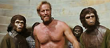
Fig. 1 Planet of The Apes, film still (1968) [image online]
Available at: http://www.cinemasquid.com/screenshots/sets/planet-of-the-apes/87658604-a190-4d28-a903-2735b14d326f
[Accessed 27 October 2014]

I’m now considering how to reinforce the links between my Research and Enquiry work and the creative process in my Practice 1 project. In time, I hope to explore the ways in which “Socially and Politically Aware Graphic Art” might express concepts of “Humanity”, which is now set to be my FAT1 keyword. But initially, I feel that I should have some deeper understanding of the term “Humanity” might represent in an academic context.

Thus, the first search I’ve made (within the UH online library) in connection with this matter is “what does it mean to be human?”, which results in a number of texts being identified with the very same title. An article by Philippe Rochat, from the Journal of Anthropological Psychology (2006), commences with the assertion that while “we share 98% of our genetic make-up with chimpanzees, we evolved unmatched ways to relate and deal with each other” (Rochat 2006: 48). Reading on, it becomes clear that this is foremost a deliberation on the intricacies of human evolution, but that Rochat has a keen interest in the ostensibly intangible qualities of the human condition: “To capture what it means to be human, I would suggest that one must focus not on what is inside the individual but rather on the way human individuals transact and share resources among themselves” (Rochat 2006: 48).

I am certainly drawn to the concept he presents of “the human niche” (Rochat 2006: 48) that we’ve carved out for ourselves in this world, always needing to adapt to a fast-changing environment in which we are the primary agents of the change: there may well be opportunities to convey such a ‘self-fulfilling prophecy’ visually…

…Also, in terms of linking with Socially and Politically Aware Graphic Art, it is interesting to note the extent to which Rochat thinks that humans are defined by “prestige” (Rochat 2006: 49), “reputation” (Rochat 2006: 49) and “property” (Rochat 2006: 50).

Approaching the same matter from a very different starting point, Pru Hobson-West’s article, Beasts and Boundaries: an Introduction to Animals in Sociology, Science and Society examines how human identity might be defined relative to animals, and the way in which our species treats animals. Hobson-West, referencing Descartes’ notion of beasts as machines, considers what justification there might be for an innate sense of superiority within humanity that leads [most of] us to assume we are dominant over other species and have the right to use them for our advantage: “Modernity relied on a positive view of humanity with animals seen as a legitimate resource to aid human progress” (Hobson-West 2007: 26).

Having discussed how mankind’s relationship with animals has changed over the centuries, particularly relative to our transition from an agrarian to industrial lifestyle, Hobson-West states that, due to ongoing technological developments, and experiments on animals over the past 150 years, it continues to evolve in ways that challenge our sense of self and concept of what humanity should be. In conclusion, taking the scallop to represent lower animal consciousness, Hobson-West asks “What is the meaning of aliveness and what distinguishes human aliveness from scallop aliveness?” (Hobson-West 2007: 36), but offers no answer.

In noting this reference to aliveness, and recognising an existentialist aspect to it, I sought out a text by Sartre that summarises his thoughts about humanity, finding an essay titled Existentialism is a Humanism. Herein he defends his philosophy while making its central tenets plain: “There is no human nature, because there is no God to have a conception of it. Man simply is. Not that he is simply what he conceives himself to be, but he is what he wills, and as he conceives himself after already existing – as he wills to be after that leap towards existence. Man is nothing but that which he makes of himself. That is the first principle of existentialism” (Sartre 1945: 3). It is both a discomforting yet potentially empowering view.

Further contemplating a darker side to mankind, M. Cherif Bassiouni states that the term ‘Crimes against Humanity’ was first employed in Article 6(c) of the London Charter at the Nuremberg Trials, though neither a formal definition nor convention for its use has ever been widely agreed. Relative to this Bassiouni professes that “the laws and writings of scholars throughout Western, Judeo-Christian, Islamic, and other civilizations have expressed the values and beliefs that life, liberty, physical integrity and personal dignity are among the fundamental rights of humanity” (Bassiouni 1993: 488).

According to the Collins Concise Dictionary, humanity is defined as follows: “humanity (hju:’maeniti) n., pl. -ties. 1. the human race. 2. the quality of being human. 3. kindness or mercy. 4. (pl., usually preceded by the) the study of literature, philosophy, and the arts, esp. study of ancient Greece and Rome” (humanity, 1995).

References

Bassiouni, M. C. (1993). ‘Crimes against humanity: the need for a specialized convention’, Columbia Journal for Transnational Law [online], 31, 1993-1994, pp.457-494.
[Accessed 17 November 2014]

Hobson-West, P. (2005) ‘Beasts and boundaries: an introduction to animals in sociology’, Qualitative Sociology [online] 3(1) April 2007, pp.23-41. Available at: https://uhvpn.herts.ac.uk/,DanaInfo=scholar.google.com+scholar?q=pru+hobson-west+beasts+and+boundaries&btnG=&hl=en&as_sdt=0%2C5
[Accessed 27 October 2014]

humanity. (1995). In: Collins Concise Dictionary, 3rd ed. Glasgow: Harper Collins, p.630.

Rochat, P. (2006) ‘What does it mean to be human’,  Anthropological Psychology [online] 17, pp.48-51. Available at: https://uhvpn.herts.ac.uk/,DanaInfo=scholar.google.com+scholar?q=what+does+it+mean+to+be+human&btnG=&hl=en&as_sdt=0%2C5
[Accessed 27 October 2014]

Sartre, J.P. (1945), ‘Exististentialism is a humanism’, University of Warwick [online], pp.1-14. Available at https://www.google.co.uk/?gfe_rd=cr&ei=nIyLVIXGCIaA0AXhgYHQCw#q=sartre-eih.pdf
[Accessed 13 December 2013]

Graphic art with a conscience

FirstThingsFig. 1 Adbusters/Garland, Ken (2000), First Things First Manifesto 2000
[image online] Available at: http://www.eyemagazine.com/feature/article/first-things-first-manifesto-2000
[Accessed 21 October 2014]

Having driven back the demands of the day job for a while, the last seven hours have been spent trawling UH’s online library portal, familiarising myself, to some extent, with Google Scholar. At some points it feels like one is searching a very (very) large field with a metal detector, but there are treasures to be found. However, it soon becomes clear that one issue to be addressed is whether these items are sufficiently academic, relative to the requirements of the SAT1 brief, and, on re-reading the brief, I’ve realised that certain results GS provides do not meet its criteria. …Thus, even an article written by a prominent journalist on The New York Times, promisingly titled “The Branding of the Occupy Movement”, isn’t substantial enough to feature in my bibliography.

The second issue I’m addressing is the need to adjust the parameters of my enquiry somewhat, focusing on Socially and Politically Aware [rather than engaged] Graphic Art: this, I feel, will highlight the conceptual aspect of such work, rather than its application or delivery (through workshops etc.). I also wish to retreat from any consideration of State-devised propaganda, which rarely, if ever, promotes the finer human qualities. Moreover, focusing the research in this way should help to inform the FAT1 project I’d like to pursue.

Relative to this, I’m reminded of the value of the First Things First manifesto, the original version of which (I’ve only recently discovered) was conceived of by British designer Ken Garland in 1963. This call for social responsibility is definitely worth further consideration…

The first manifesto, signed by Garland and 21 of his contemporaries, was “a reaction to the staunch society of 1960s Britain and called for a return to a humanist aspect of design” (Design is History, n.d.). It spoke disparagingly about the trivial commercial content produced by mainstream design and advertising studios, proposing instead that the creative sector “focus efforts of design on education and public service tasks that promoted the betterment of society” (Design is History, n.d.).

Although the manifesto received some media attention in 1964, it was not until 1999, when Kalle Lasn of Adbusters revised and updated the idea in collaboration with Garland – having come across it in a back issue of Eye magazine – that it gained widespread support, and the backing of 33 eminent signatories including Milton Glaser, Tibor Kalman and Vince Frost. Published in 2000, “Adbusters’ welcome initiative reasserts these considerations as fundamental to any sensitive interpretation of graphic design’s role and potential” (Eye Magazine, Autumn 1999).

Currently, a British-based Canadian designer called Cole Peters is inviting all interested parties to sign a 2014 version of the manifesto, having contacted Garland by email: “[Ken’s] been very supportive of me taking this on — although he’s also told me that he personally feels the 2014 draft might not add much to its earlier iterations” (Design Week, 4 March 2014).

Unfamiliar with Ken Garland or his creative work, I wanted to know something about his practice, especially as Eye Magazine attests that “although he is a key figure in the development of graphic design since the mid-twentieth century, Garland’s design work is less known than that of his peers. He rarely exhibits it. He never publicly discusses it. He is interested in communicating ideas but believes his own interpretations of those ideas should speak for themselves” (Eye Magazine, Winter 2007).

The images below offer a fair representation of his style, incorporating a vibrant use of colour – frequently overlaid to create ‘extra’ extra colours (a technique seldom seen these days within digital production structures) – and a bold, playful approach to typography that often focuses on specially drawn characters that are modernist way epitomising the future-facing zeitgeist of the sixties and early seventies.

CamdenFig 2. Ken Garland, Camden Committee for Community Relations logo (1966) [image online] Available at: http://a1.dspnimg.com/data/l/161609010552_4PKX7p3M_l.jpg
[Accessed 13 December 2014]

Toys
Fig 3. Ken Garland, Galt Toys logo (1968) [image online] Available at: http://www.creativereview.co.uk/images/uploads/2011/03/ken_garland_galy_tots_0.jpg
[Accessed 13 December 2014]

RailMag
Fig. 4 Ken Garland, Design Magazine (1963) [image online] Available at: http://1.bp.blogspot.com/-JBi9txTxKx0/UWJxYAuXi7I/AAAAAAAAAGE/HYB0hC6kniE/s1600/url-10.jpeg
[Accessed 13 December 2014]

References

Barnbrook, J., Kalman, T., Lupton, E., McCoy, K., Poynor, R., Miller, J.A., Roberts, L., van Toorn, J., VanderLans, R., Wilkinson, B., Bell, N., Keedy, J., Licko, Z., Mevis, A., Howard, A., Helfand, J., Glaser, M., Blauvelt, A., Bockting, H., Boom, I., Levrant de Bretteville, S., Bruinsma, M., Cook, S., van Deursen, L., Dixon, C., Drenttel, W., Dumbar, G., Esterson, S., Frost, V., Garland, K., Spiekermann, E. (Autumn 1999) ‘First Things First Manifesto 2000’ Eye Magazine [online] Available at: http://www.eyemagazine.com/feature/article/first-things-first-manifesto-2000
[Accessed 13 December 2014]

Design is History (n.d) First Things First Manifesto [online] Available at: http://www.designishistory.com/1960/first-things-first/
[Accessed 13 December 2014]

Montgomery, A (4 March 2014) ‘Updating the First Things First Manifesto for 2014’ (4 March 2014) Design Week [online] Available at: http://www.designweek.co.uk/analysis/updating-the-first-things-first-manifesto-for-2014/3038037.article
[Accessed 13 December 2014]

Odling-Smee, A. (Winter 2007) ‘Reputations: Ken Garland’ Eye Magazine [online] Available at: http://www.eyemagazine.com/feature/article/reputations-ken-garland
[Accessed 13 December 2014]

Links

http://www.eyemagazine.com/feature/article/first-things-first-manifesto-2000

http://www.kengarland.co.uk/

The art of revolution

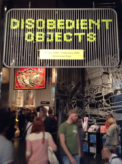
DisobLoFig. 1 Photograph by Glenn Rickwood, Disobedient Objects exhibition,
V&A, London (2014)

During the recent London Design Festival, I visited the V&A to take in its linked events focusing on Graphic Design. Generally, I found it to be less engaging than the 2013 presence, which was nested in one area of the museum and not dissipated over its vast floorspace and many floors. However, the Disobedient Objects exhibition, positioned near the main entrance, was both provocative and as visually rich as most of the artefact-makers were materially poor. The exhibits included gas masks made from water bottles, miners’ union banners, Class War pamphlets and shields made from over-sized book covers. These objects, and the images that [dis]grace them, serve as an apposite reminder that the over-designing of product and content within ‘First World’ society often does us all a disservice – including designers – by prioritising form over function and shifting attention away from the core message being communicated. …And, unlike the vast majority of such product/content, these messages are driven by egalitarian values, not profit motives.

MinersFig. 2 Anon. (photograph by Glenn Rickwood), miners’ strike banner (1984),
Disobedient Objects exhibition, V&A, London (2014)

BooksFig. 2 Anon. (photograph by Glenn Rickwood), book bloc shields (2011),
Disobedient Objects exhibition, V&A, London (2014)

Complementing the Disobedient Objects exhibition was another, of similarly compelling content, called A World to Win: Posters of Protest and Revolution. It presented a range of protest poster art from the past 50 (or so) years, addressing different sociopolitical problems around the world. And while it was interesting to see socially committed work by renowned practitioners such as David King and Designers Republic, the statements being made by lesser-known artists and anonymous activists (including students involved in the 1968 Paris riots) are often those that convey the most passion and achieve most impact. Most of the posters are simple in terms of composition, combining an assertive strapline with a strong graphic image. But it’s unquestionably this simple formula that can make them so effective.

BurningFig. 2 Jon Crossland, for The Body Shop, (photograph by Glenn Rickwood),
Stop the Burning poster, A World to Win: Posters of Protest and Revolution exhibition, V&A, London (2014)

WomenFig. 3 See Red Women’s Workshop (photograph by Glenn Rickwood),
So Long as Women are Not Free the People are Not Free (1975),
A World to Win: Posters of Protest and Revolution exhibition,
V&A, London (2014)

OilFig. 4 Anthony Burrill (photograph by Glenn Rickwood),
Oil & Water Do Not Mix (2010), A World to Win: Posters of Protest and Revolution exhibition, V&A, London (2014)

BoycottFig. 5 Mountain and Molehill, for the Boycott Committee (photograph by Glenn Rickwood), Against Apartheid, Boycott South African Goods (1960), A World to Win: Posters of Protest and Revolution exhibition, V&A, London (2014)

PressFig. 6 Atelier Populaire (photograph by Glenn Rickwood),
Armeé ORTF Police (1968), A World to Win: Posters of Protest and Revolution exhibition, V&A, London (2014)

Today, in further considering the matter of protest art, I’ve been leafing through the book “Design Anarchy” by Adbusters’ Kalle Lasn (2005), which is weighty enough to be used as a missile during civil disobedience (though I’d not condone such behaviour), and relentlessly disobedient in its response to the constructs and constraints of capitalism. Lasn’s design-style is vital yet controlled, the rough and ragged edges underpinned by a sure, almost forensic, thought process.

…His conviction is certainly impressive, making me reflect on the path my own design practice has followed in the last 20 years, relative to industry pressures and, perhaps, personal weakness: is it not a shame, and somewhat shameful, that graphic design has become primarily a tool with which to sell things?

For, as Lasn declaims on page – (by design, there are no folios in this book), do we really want to be defined by “The house; the car; the things”…?

HouseCarThings
Fig. 7 Kalle Lasn, Untitled Image [‘The Car, the House, the Things’], 2006, Lasn. K (2006), Design anarchy. Vancouver, B.C. Adbusters Media Foundation, p–

References

Lasn, K. (2006), Design anarchy. Vancouver, B.C.: Adbusters Media Foundation.

Links

https://www.adbusters.org/

http://www.vam.ac.uk/content/exhibitions/disobedient-objects/

http://www.vam.ac.uk/blog/section/disobedient-objects

Socially engaged graphic art

mittaFig 1 Siouxsie and The Banshees (1979), Mittageisen;
John Heartfield,  Hurrah, die Butter ist Alle! (1935) [image online] Available at: http://upload.wikimedia.org/wikipedia/en/5/5f/Siouxsie_Mittagessen.jpg
[Accessed 14 October 2014]

…This is the working title for my R&E work, having considered quite a few, but may change as matters proceed.

In the politically charged atmosphere of Britain in the late ’70s and ’80s, I became aware of both Constructivist and Dadaist imagery, appropriated as it was by graphic artist/designers such as Jamie Reid, Linder Sterling, Malcolm Garratt, Dennis Morris and Peter Saville in their efforts to visually represent the energy and disaffection of punk and post-punk, music at that point being the prime social and political signifier for ‘Youth’: for example, the first time I ever saw a John Heartfield montage was on the cover of Siouxsie and The Banshees’ single, “Mittageisen”. Struggling to find my own visual identity within this cultural stew became the main focus of my first passage through the Art School system, leading me from the Hertfordshire College of Art and Design (where Banshees guitarist John McKay had also gained a Foundation Diploma) to Middlesex Polytechnic (where Adam Ant had also sought a graphics degree during its Hornsey incarnation). Without doubt, the need to challenge the ‘Establishment’ within one’s art/design practice, and to react to the divisive politics of the time, was de rigeur for any self-respecting art student (even those studying fashion).

In examining some of the art/design work I made during this period I still feel curiously connected to it, and a mid-life urge to apply its spirit – hopefully, refined in some ways – to the pros and cons of the Digital Age. And, to my eyes, Constructivism can still appear many years ahead of what passes for mainstream commercial art, much as Dadaism still seems radical in how it continues to shape the desire to question the 21st Century status quo. (…While Metal Box, by PiL, is about as radical as popular music has yet managed to be.)

The need for art/design to engage with the important issues of the day remains paramount, I’d say, but all too often this is evident by its absence from sociopolitical debate. …Thus, as I recently made my way through the streets of London (to visit The Barbican’s somewhat underwhelming “Digital Revolution” exhibition), it was inspiring to come across the work of photographer Michael Thomas Jones posted across hoardings on the Goswell Road: his A9 Project – a series of portrait-led posters – addressed the issue (as of then undetermined) of whether the Scots would vote for independence; very much an intriguing, apposite and well-delivered concept.

A9Fig. 1 Michael Thomas Jones (photograph by Glenn Rickwood), A9 Project (2014), Goswell Road, London.

Links

http://michaelthomasjones.com/A9-IMAGES

http://www.theguardian.com/politics/gallery/2014/aug/29/a-journey-on-the-a9-scotlands-highway-of-history

Lines of enquiry

DataSMsF1iiLoFig. 1 Glenn Rickwood, Data Satanic Mills (2013), digital image

Over the next two years, I’m set on exploring the links between analog and digital technologies relative to the exponential sociopolitical changes prompted by the latter. (As such, the image shown above features factory chimneys delineated by Google search engine source code.)

However, in taking an overview of the course, across its full span, I’m wondering whether to defer my enquiries into the above until the Discourse and Reflection module in Year 2, and start my research journey – i.e. the Year 1 Semester A Research & Enquiry module – with a broader consideration of [socio]political, protest and propaganda-linked graphic design. This might then inform, and provide a context for, a two-semester-long exploration of the analog/digital issue, while I further develop an understanding of its conceptual and technical aspects within my Year 2 creative Major Study.

As part of this investigation, I’d consider the connections between movements and groups such as Constructivism and Dada, Post-Modernism and Occupy, perhaps gaining an insight into how a graphic art response to the Digital Revolution might best be framed…